Experiment Log 1A
1A. Mycelium Cultivation Typography
AIM:
This experiment aimed to investigate the potential of mycelium growth on petri dishes to inspire the development of a new typeface through material-based experiments. The process involved closely observing and interpreting the functions and growth characteristics of mycelium to use as a source of creativity and experimentation to develop a unique and distinctive typeface.
“Control” experiments of the Pearl Giant Oyster (PGO) and Reishi species on DAY 1 vs DAY 7

PRECEDENTS:
Pentagram and Counterpoints collaborative project, Hypha is an interactive tool that generates a typeface visually simulating the outcome of mycelium growth. I sought to differentiate my experiment from this project by focusing on the processes of the growth (biomimicry), in contrast Hypha’s typeface that imitates the visual outcome of the final mycelium growth (biomorphism).
Megan Wong’s An Index of Bacteria project exploring the invisible traces users have left on library books inspired me to attempt to grow mycelium on petri dishes. I wanted to observe the growth of mycelium first hand, and examine how hyphae would connect together to develop a mycelium network.

METHODS:
Without knowing much about the process of cultivating mycelium on petri dishes, I researched how mycelium cultivation worked online, contacted Megan Wong and consulted Root Labs, a mycology supply business in Sydney. I asked Megan about her general process for cultivating bacteria and any advice on her photography process. At Root Labs, I asked which agar would be best for mycelium cultivation, if cultivating mycelium at home would be possible and attainable, as well as which species would be best for the fastest growth.
From Megan, her tip of placing the petri dishes inside a shoe box next to a sunny window (as the bacteria, and mycelium alike required a dark, humid area) was most valuable. Photography wise, she suggested placing black paper behind the dishes and photographing them in the early morning, before direct sunlight hits. Taking in these suggestions, I also used an A3 black cardboard so I was able to place several petri dishes at once, and photographed them during the day, anytime before the sun set (normally around 9am or 3pm).
Root Labs suggested that malt extract agar would be most suitable for mycelium cultivation as it is an acidic culture media designed to cultivate fungi whilst inhibiting bacterial growth. As different mushroom spawn species grew differently, I asked which species would grow fuzzier and veinier so I could have two different types of outcomes to compare. In response to this, the species Reishi was suggested to be veinier, and Pearl Giant Oysters (hereafter called PGO) would be fluffier. Both these species were also recommended as they would grow rapidly, which would be ideal for my experiments.
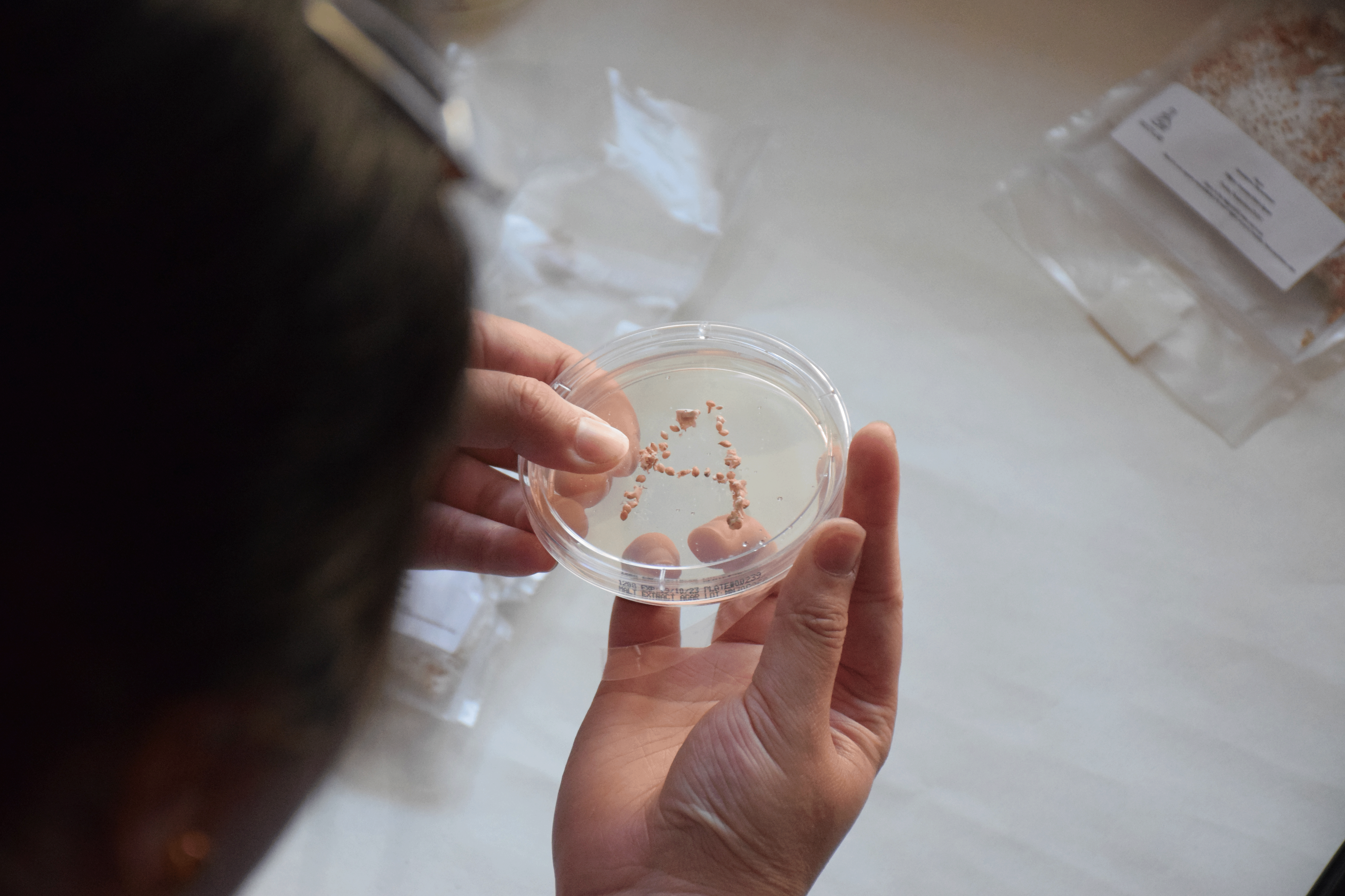
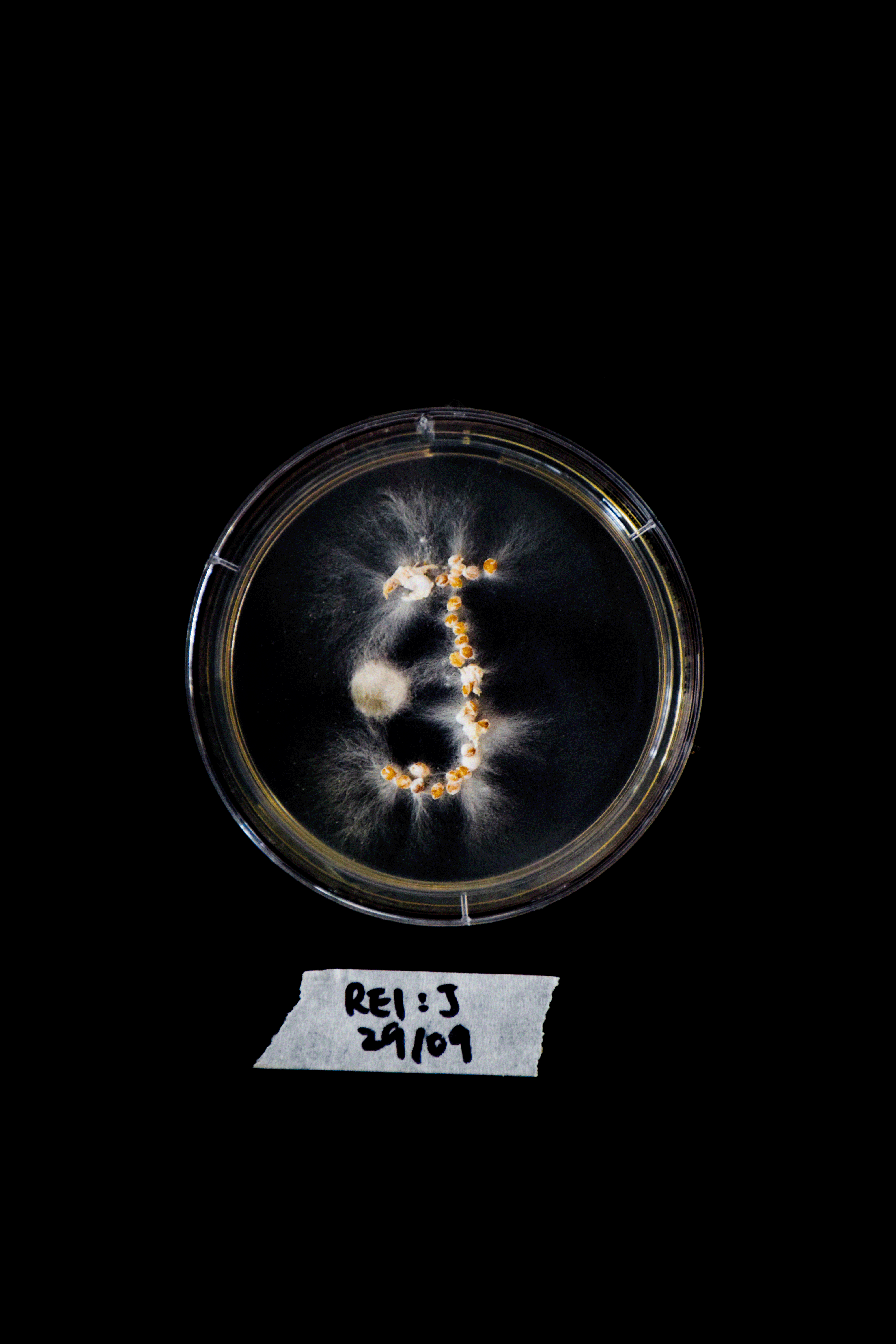
For the typeface, I created a letter of the alphabet on a petri dish each, and alternated between the species so I would be able to observe the difference in growth for each species. The grain spawns were carefully placed using tweezers to imitate the generic form of each letter of the alphabet. The daily growth was photographed and observations of the growth was written down in my Observation Log.
Refer to the Extended Methodology (1) to read the Process in detail.
Placing the grain spawn onto the petri dishes in the shape of each letter of the alphabet

OBSERVATIONS:
Pearl Giant Oysters grow significantly fast. On Day 3, the white mycelium was very noticeable, whereas Reishi had only just started forming some small traces of mycelium. The direction of the mycelium was always unpredictable, and was difficult to know where and how much it would start growing next. PGO is very fluffy and seems to grow outwards and upwards towards the petri dish lid, in contrast to Reishi which is much more linear and grows flat on the agar.
Unfortunately, mould started growing on some of the petri dishes on Day 5. At first they were small spots of green, and eventually grew fuzzier and larger over the next two days. Interestingly, on some dishes, the mycelium was starting to take over or combine with the mould. Perhaps the strains of mycelium were even stronger than mould?
Refer to the Extended Methodology (1) to read the Observation Logs in detail.
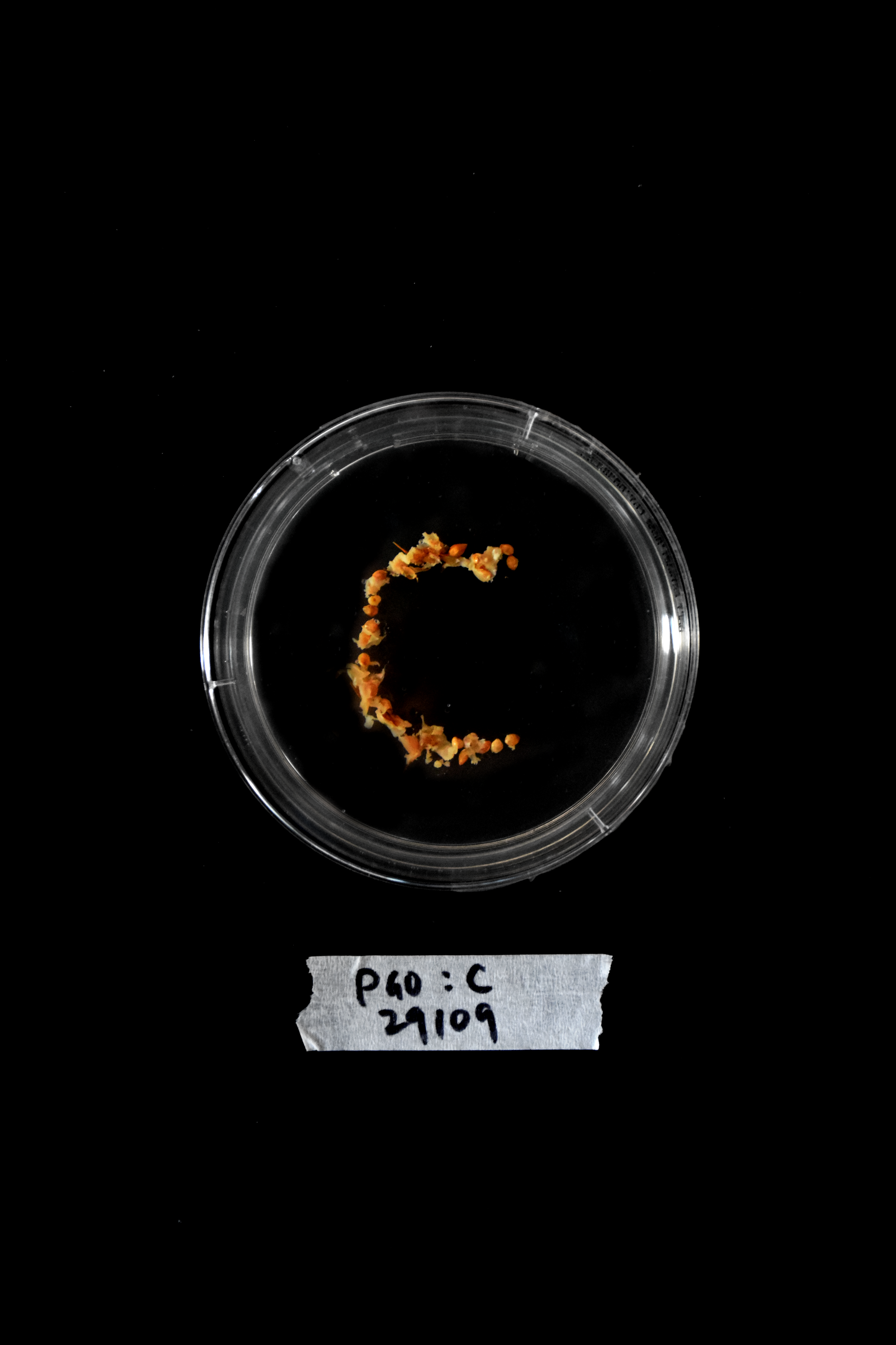
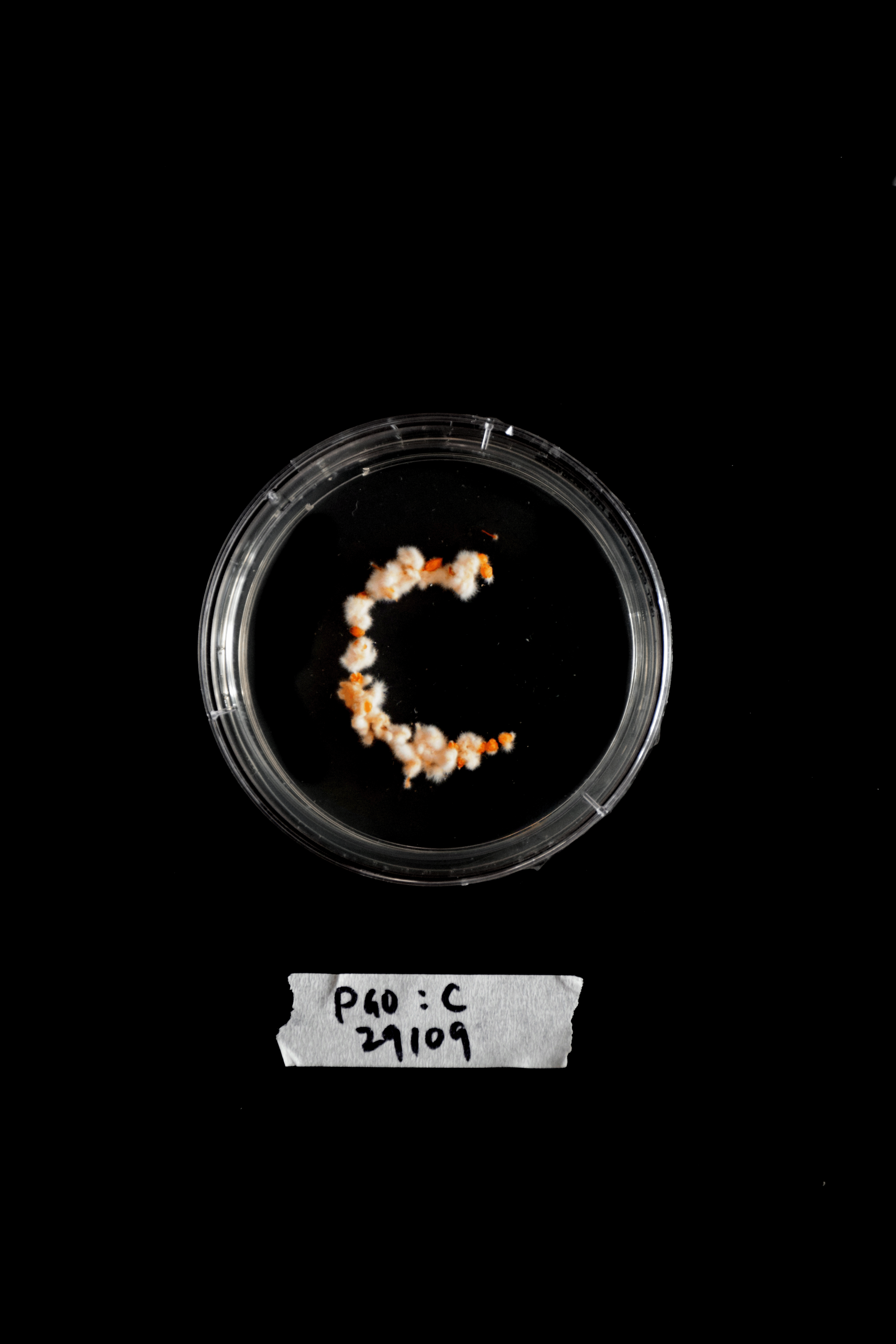
Growth of the letter C (PGO) on DAY 1, 3 and 5
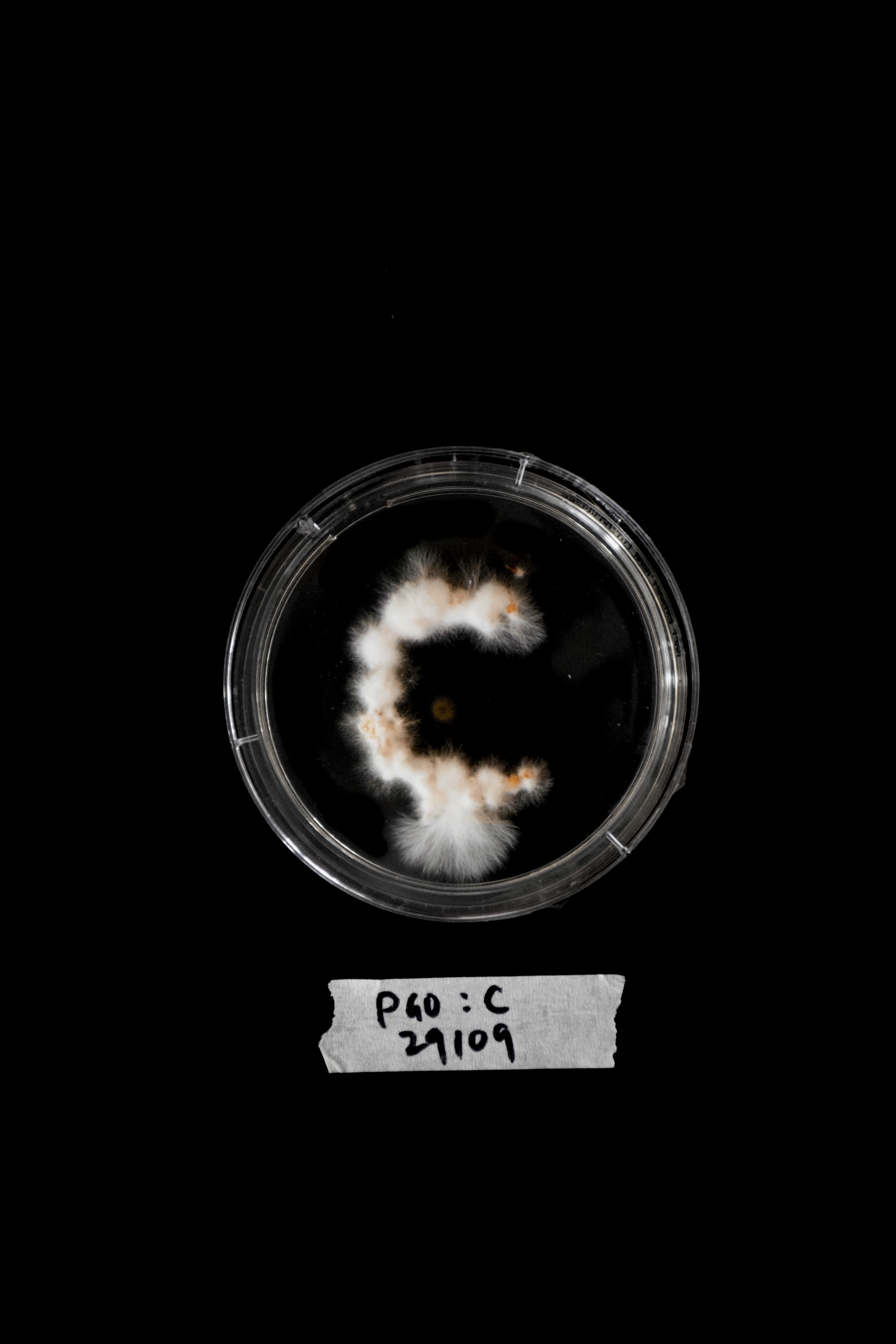
Growth of the letter C (PGO) on DAY 7

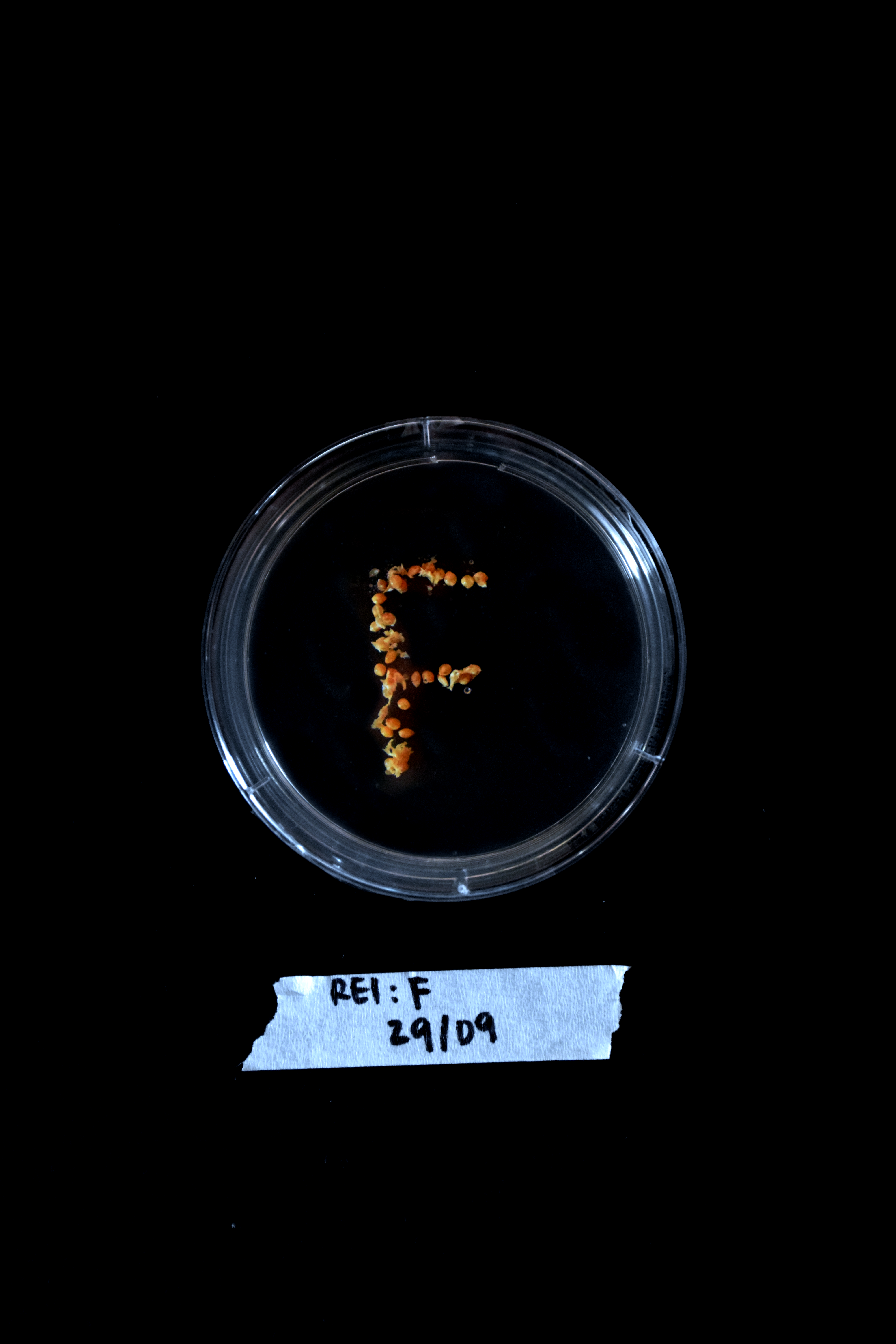
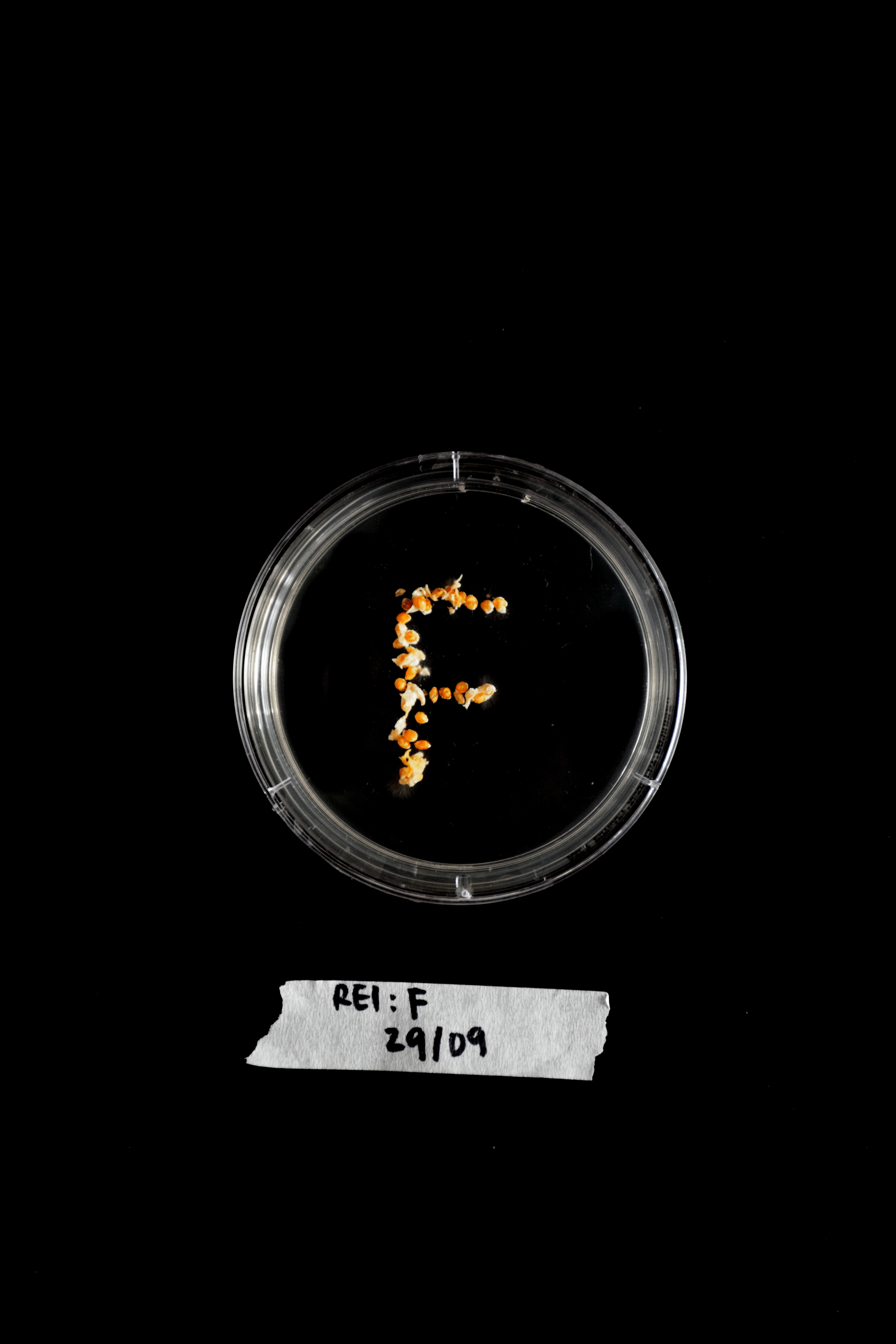
Growth of the letter F (Reishi) on DAY 1, 3 and 5
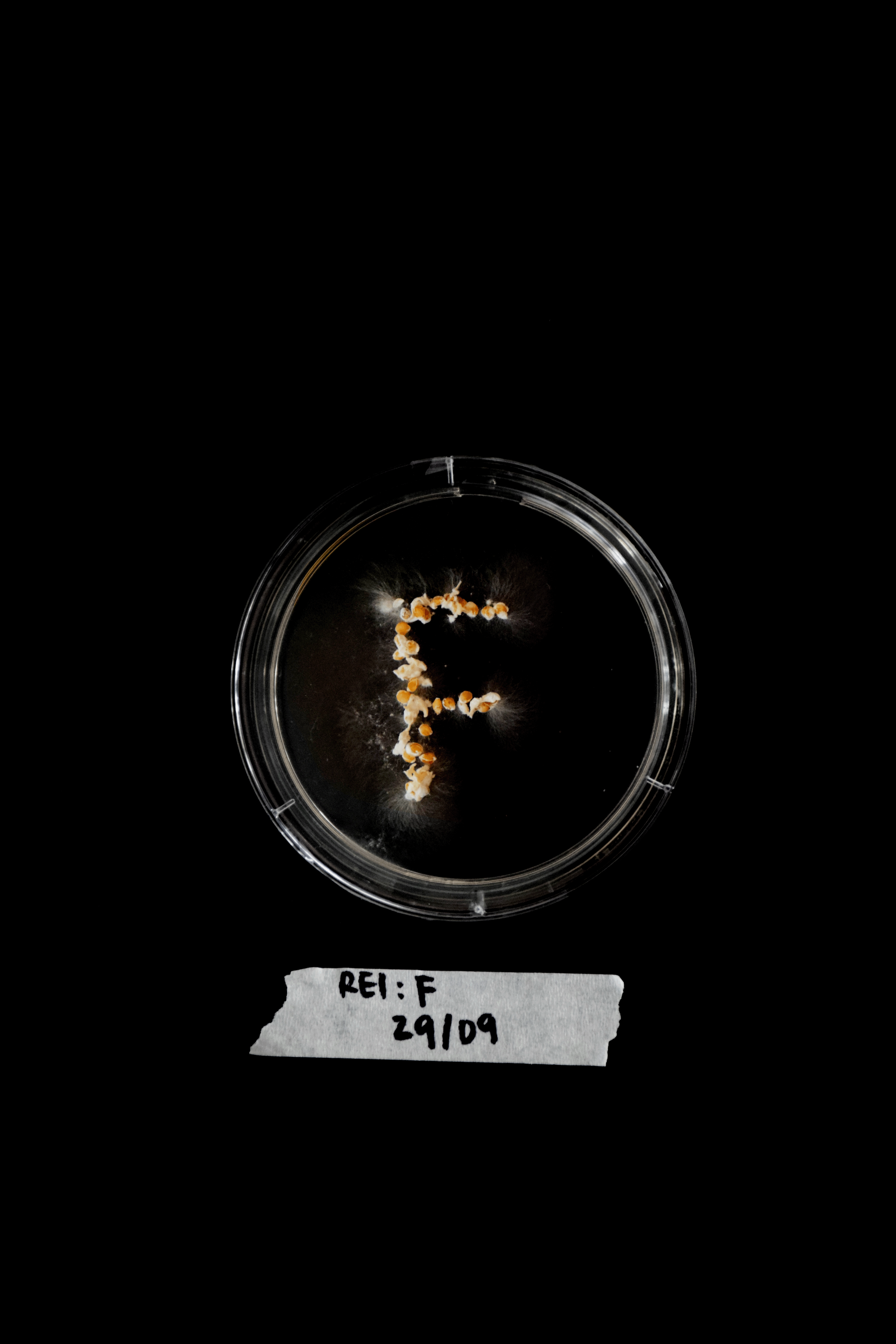
Growth of the letter F (Reishi) on DAY 7

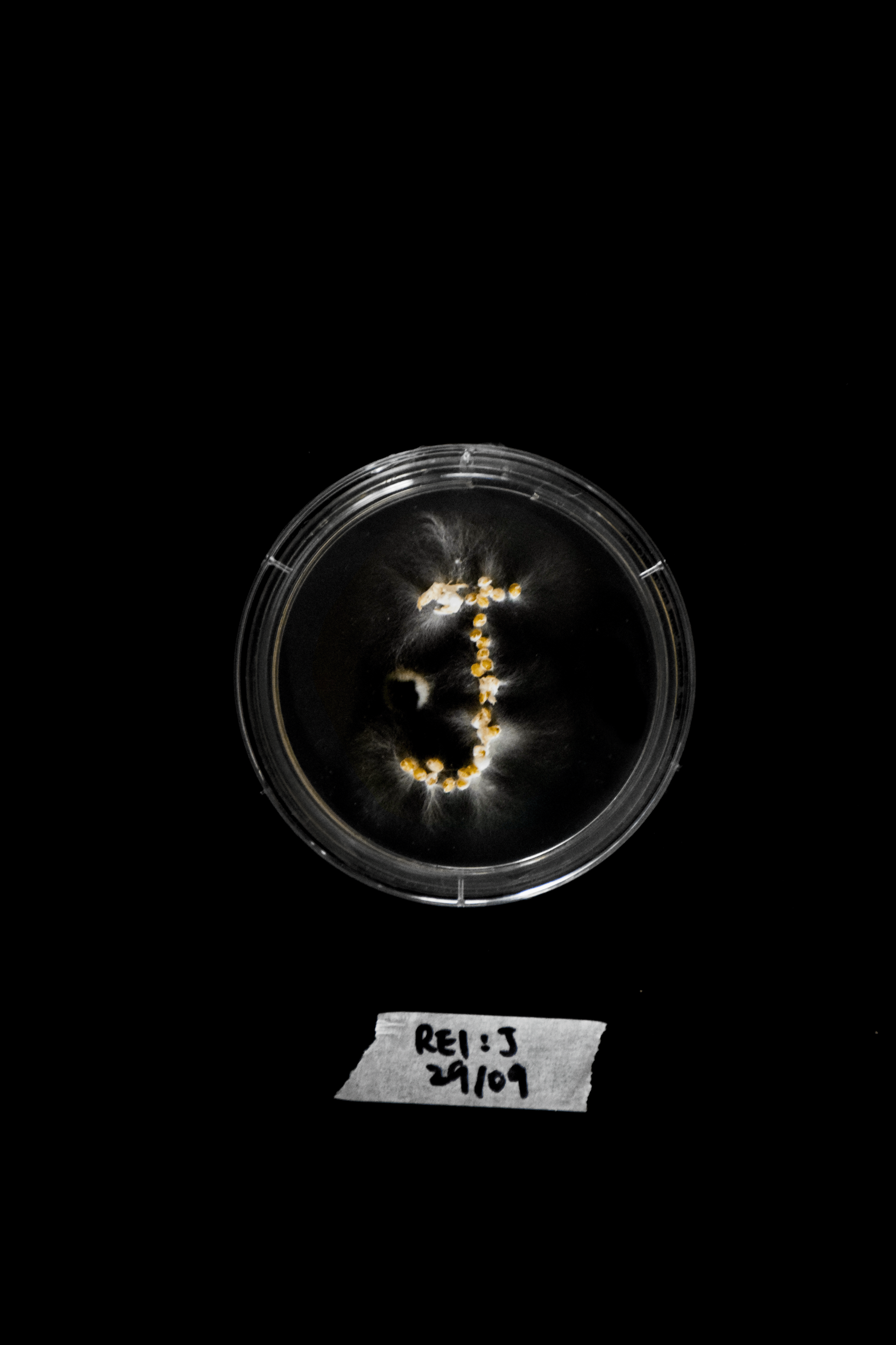
Bacteria starting to grow on the letter J on DAY 5 and 7
Mycelium Alphabet on DAY 7

REFLECTION:
In this experiment, a more-than-human perspective was incorporated through collaboration with non-humans - the mycelium. Growing the typeface characters with mycelium emphasised this co-creation. The mycelium grew along the paths I created using the grain spawn, and created various unique and unpredictable type forms.
Unexpected variables like bacteria growth on the petri dishes were also factors that I had expected, but did not consider deeply about how they could also influence the growth of the mycelium typeface. If I was to recreate this typeface digitally, I would include the bacteria growth as a design element of the typeface. However, if I wanted to focus on just the mycelium growth and not want external factors disturbing this process, I would redo this experiment in a more sterilised environment.
Observing the mycelium grow directly made me recognise the significance of first-hand observations in comparison to secondary materials like viewing images or videos online. Initially I had considered only using online images of mycelium growth as the main precedents to inspire the development of a new typeface. However, by experiencing the growth of a natural organism first-hand, I was reminded of how there is still so much to learn from nature, even just by observing.
DESIGN RESPONSE:
From these observations, I was intrigued by the rapid speed and amount of growth of the mycelium that had happened during this short time frame. I used the documented photographs I had taken each day and compared the quantitative difference of this growth.
Specifically, I focused on one letter, comparing its appearance on Day 1 and Day 7. To do this, I outlined the growth on both days and then subtracted the Day 1 outline from the Day 7 outline. This subtraction resulted in a shape that represented the overall growth of the letter. As these shapes initially grew from an existing letter, the final subtracted forms still resemble letters from the alphabet.
I further experimented with these forms and emphasised the growth of mycelium by creating a three-dimensional version of each letter that incorporated the textures and colours of mycelium. Using these forms as a foundation to create a three-dimensional (3D) version of each letter, I then added on the textures and colours associated with mycelium. The ultimate result of this experiment was a 3D mycelium typeface that visually represented the quantitative growth of mycelium over the course of seven days.
Process of creating the 3D Typeface
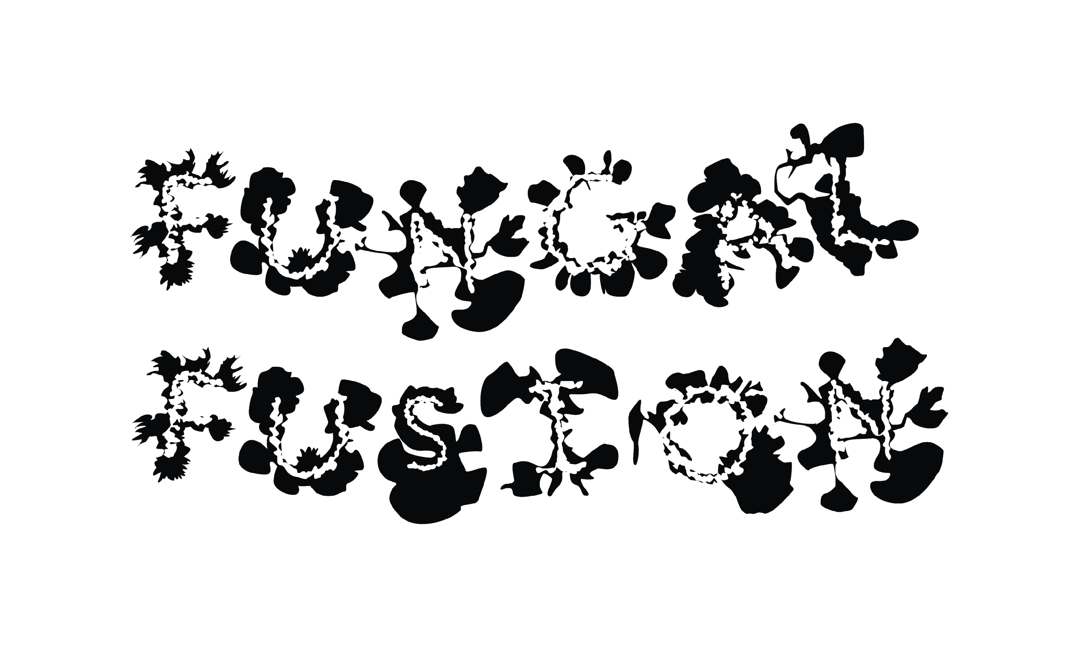

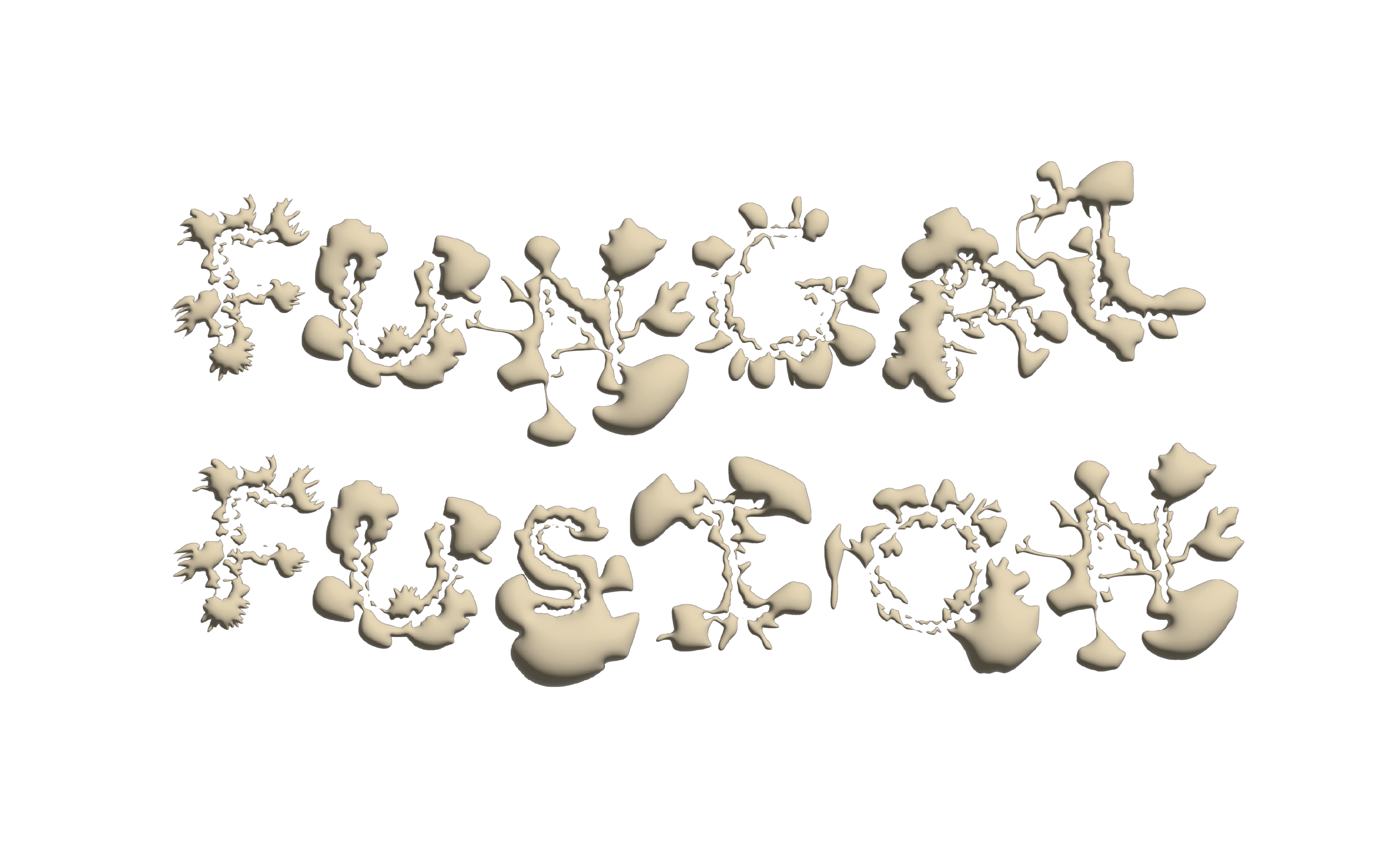


3D Typeface created using the Mycelium Growth over seven days


Experimenting with other textures (metallic)
![]()

3D Mycelium Typeface reflecting DAYS 7’s growth
![]()
![]()


The typeface produced from these findings effectively showcases how the process of mycelium cultivation can inspire a new typeface. Consequently, it highlights one of the numerous possibilities of integrating biomimicry into visual design. The organic shapes and textures, mirroring mycelium's characteristics, accentuate the fusion of natural elements. The typeface itself possesses a dual nature, teetering on the boundary between legibility and decoration, rendering it somewhat ambiguous yet distinguishable. In this duality, the typeface reflects the multifaceted aspects of nature, combining both functionality and beauty.
The successful application of biomimicry, as seen in the observation and incorporation of mycelium growth into design, illustrates how designers can embrace a perspective that extends beyond the human-centric view in their creative work. Furthermore, it opens up fresh insights into how they might approach typographic design in the future, incorporating elements inspired by nature and mycelium's unique qualities.
REFLECTION FOR ACTION
In this experiment, I had initially arranged each grain spawn meticulously using tweezers to shape specific letters. Consequently, the final growth of the mycelium letters was largely predetermined by these initial placements.
For my next experiment, I aim to delve deeper into the unpredictability of mycelium growth. Instead of carefully arranging the grain spawn in precise and pre-designed letter shapes, I want to experiment with a more random and haphazard placement of the grain spawn. The objective of this is to observe how this less structured approach could impact the growth of the mycelium and whether the resulting letters would still be recognizable and legible. This change in approach will allow me to explore the mycelium's ability to create more organic and spontaneous shapes, which might challenge the legibility and formation of the letters compared to the initial, meticulously arranged experiment.