Experiment Log 3B
3B. Mycelium Formation Radial Layout
CONTINUED AIM:
Expanding on Experiment 3A by substituting different paper stocks instead of using a notebook, this experiment explores how the mycelium network and its unique structure and formation could be mimicked to create an alternative layout structure through observations of the mycelium growth process.
METHODS:
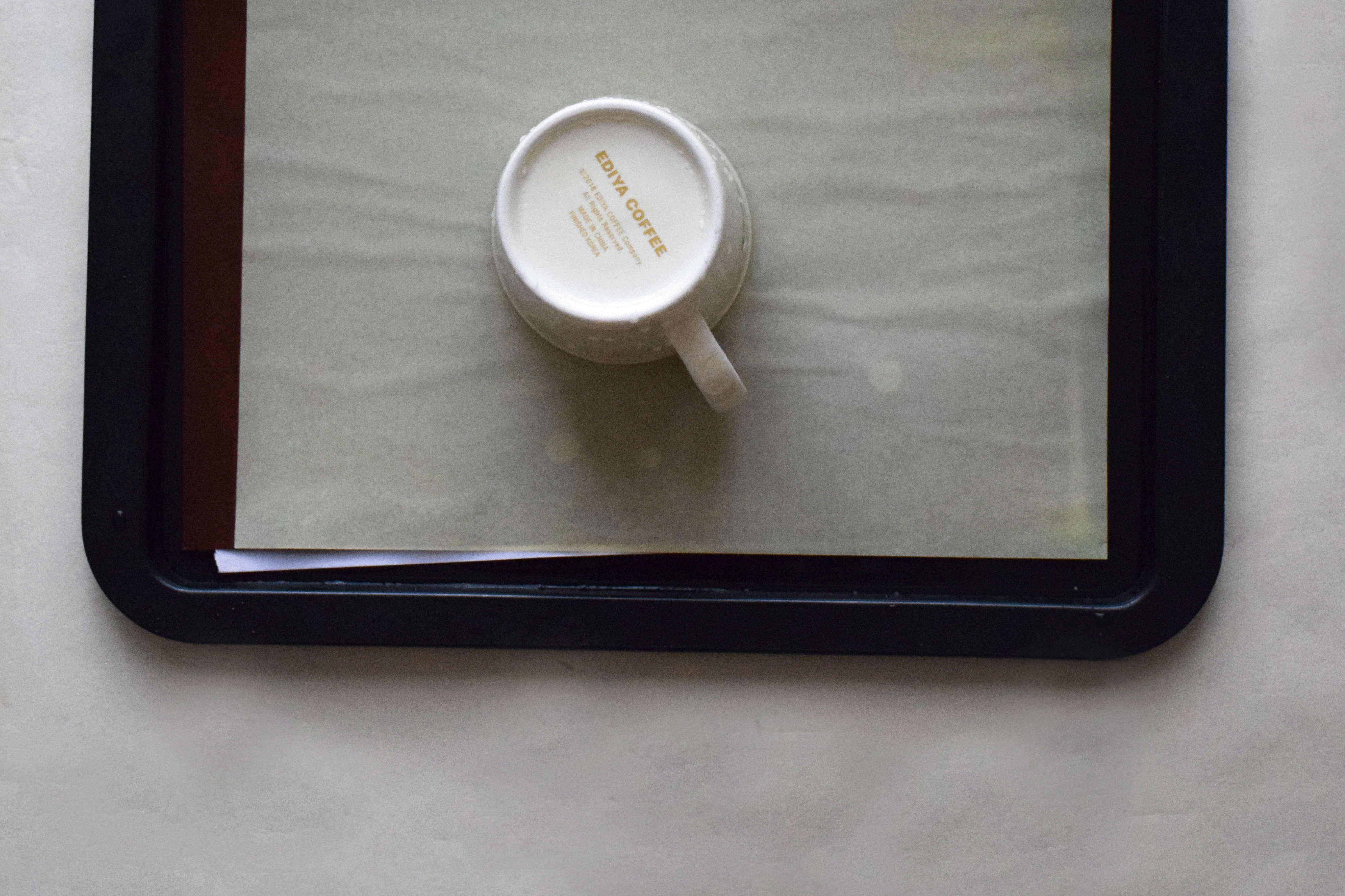
Refer to Experiment 3A’s process for the set-up process.
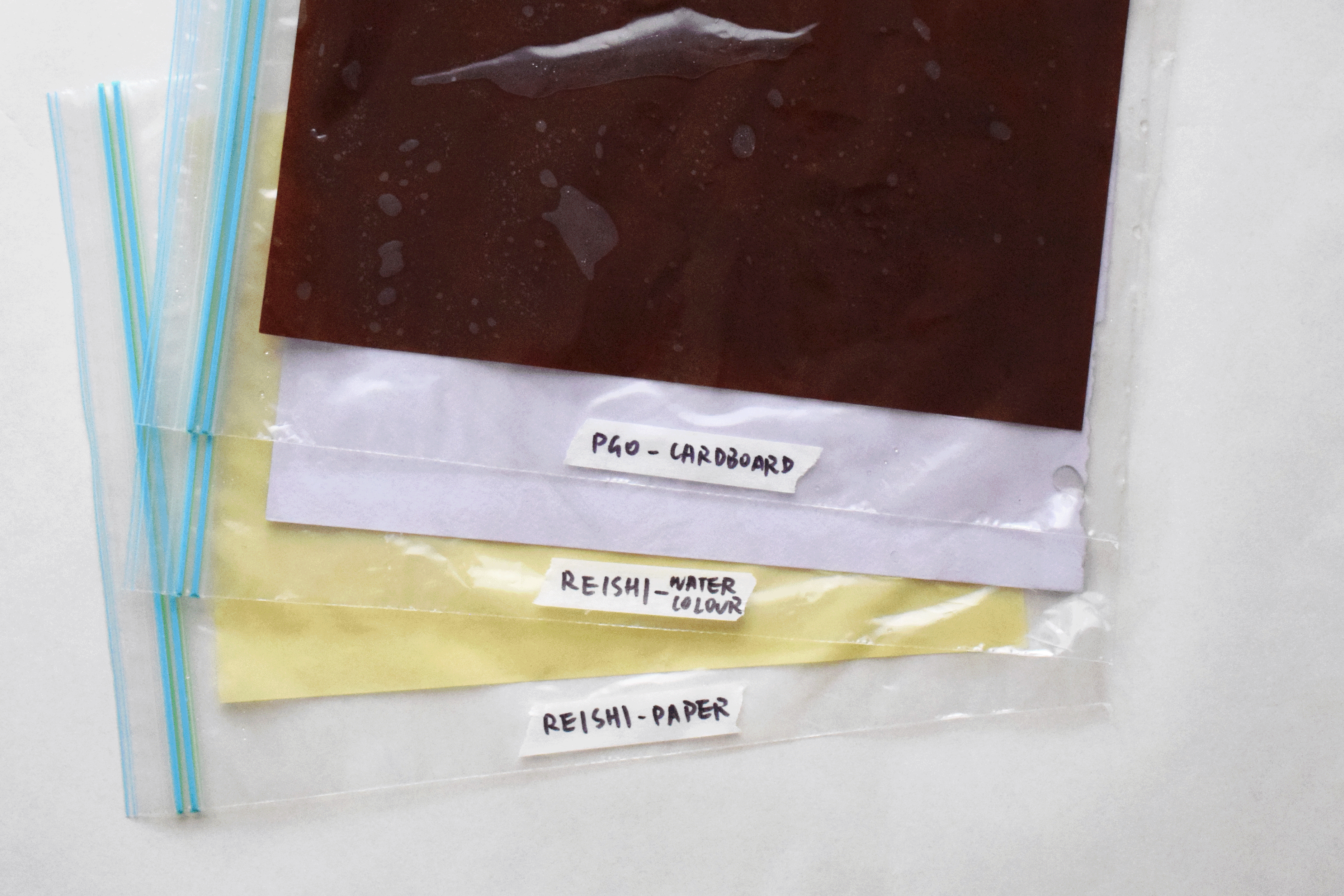
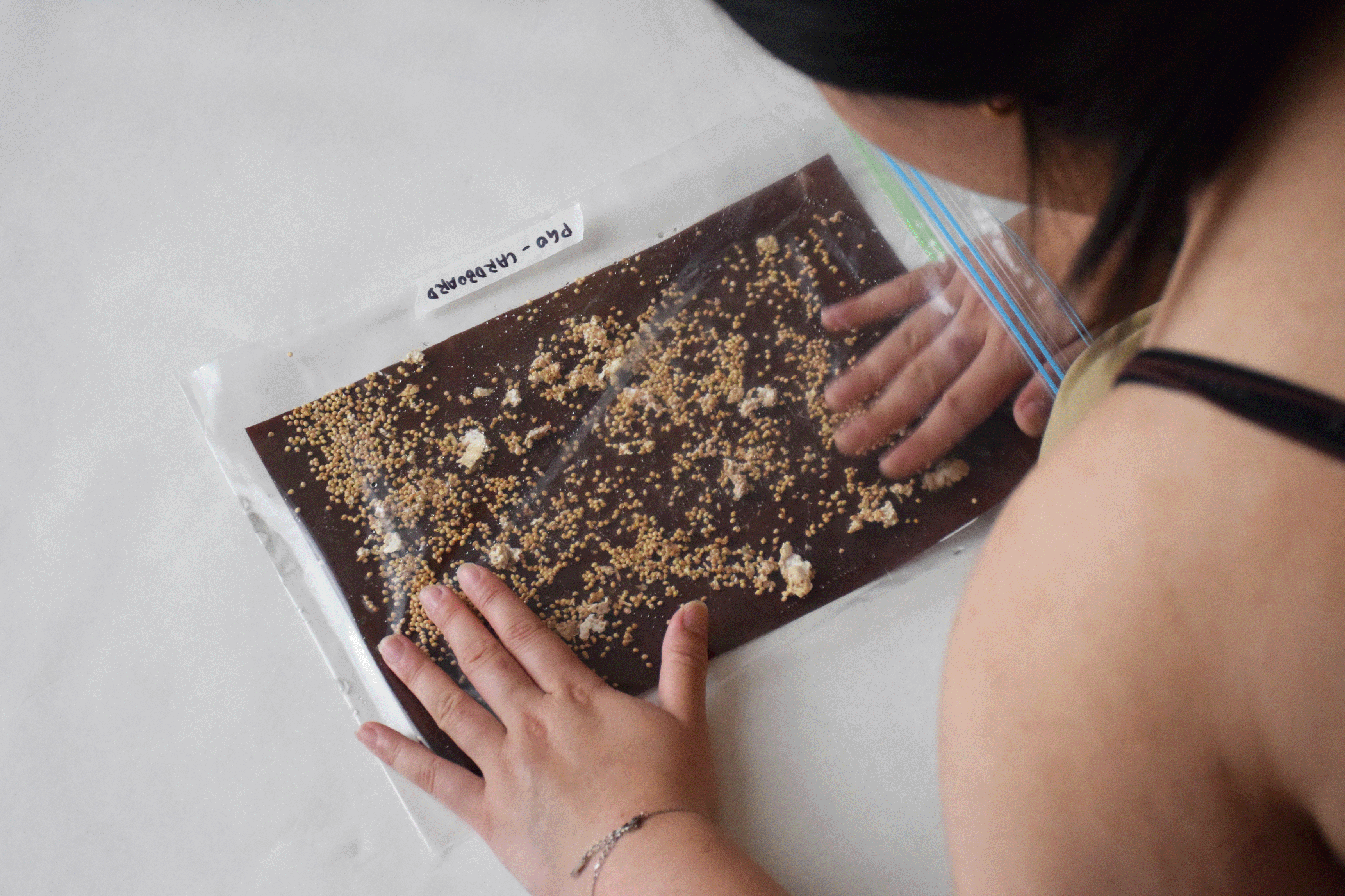
Rather than utilising a notebook as the primary medium for mycelium growth, it was exchanged for three distinct paper stocks. These papers were all A4-sized, including cardboard, watercolour paper, and copy paper. The cardboard had a 200gsm thickness and dark brown colour. The watercolour paper was off-white and 180gsm thick, while the copy paper was yellow and 80gsm thick. I opted for dark-coloured papers to ensure the white mycelium's growth would be easily distinguishable.
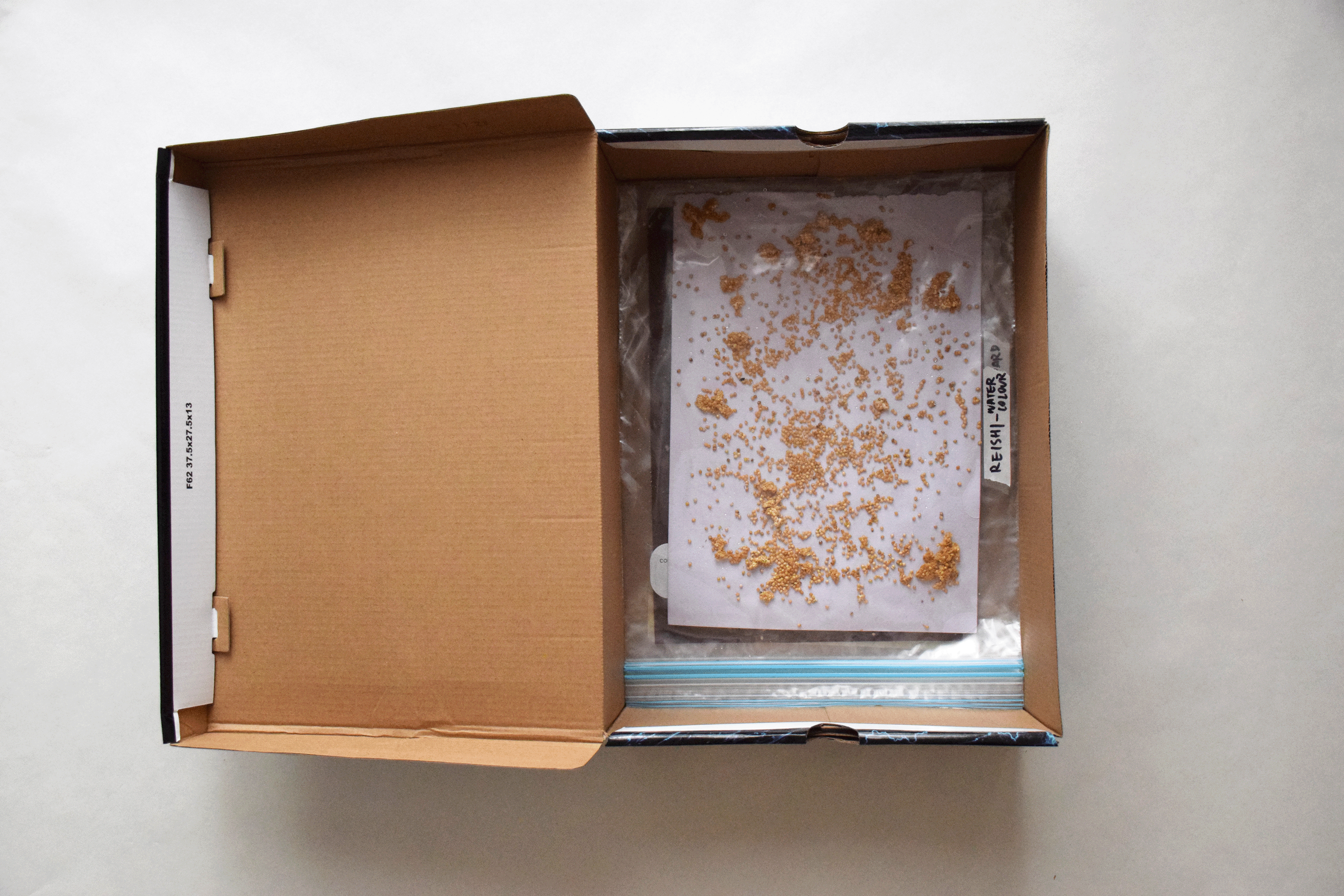
I used two different grain spawn species, Pearl Giant Oyster (PGO) and Reishi, to assess their individual impacts on mycelium formation. Initially, I placed PGO on the cardboard and watercolour pad, and Reishi on the copy paper. However, after a few days, I introduced an additional Reishi experiment on the watercolour paper to enable a direct comparison of both species' growth on the same controlled paper stock.
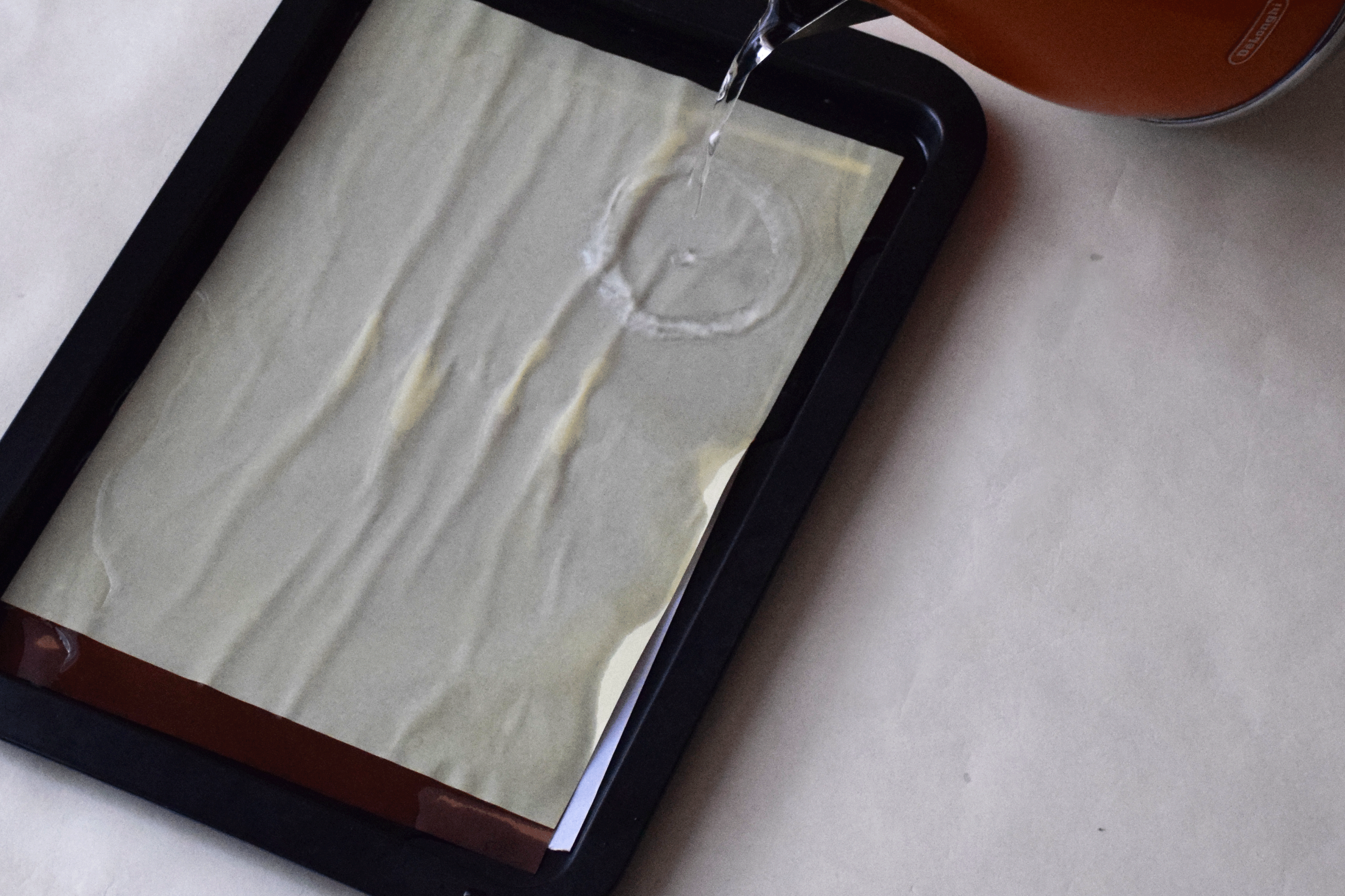
Once the mycelium was showing its initial signs of growth, I started misting it with water once a day.

OBSERVATIONS:
In general, the mycelium exhibited varying rates of growth on different paper stocks. By Day 3, the PGO on Cardboard displayed the initial signs of mycelium growth on the surface. The mycelium had begun to extend from the already cultivated clumps of grain spawn and was progressively spreading to neighbouring grains. By Day 4, the mycelium had rapidly covered all the grain spawn, a speed of growth that took me by surprise.


On both Day 5 and Day 6, the mycelium growth was so fast and uncontrollable that it began to press against the confines of the ziplock bag. At this point, it became challenging to discern the extent of mycelial expansion. Eventually, the mycelium ceased growing, instead giving way to mould growth on each of the paper stocks.


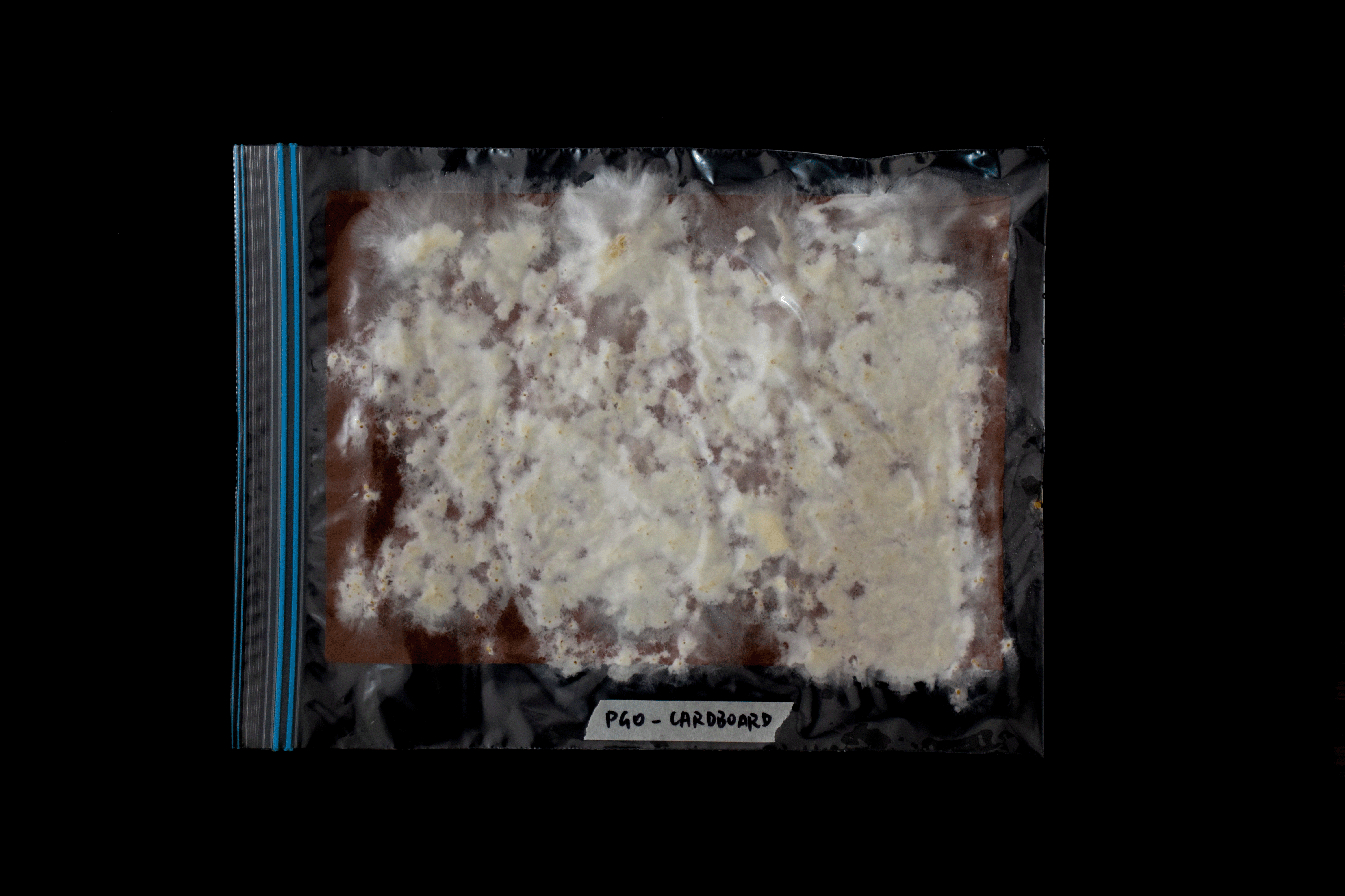
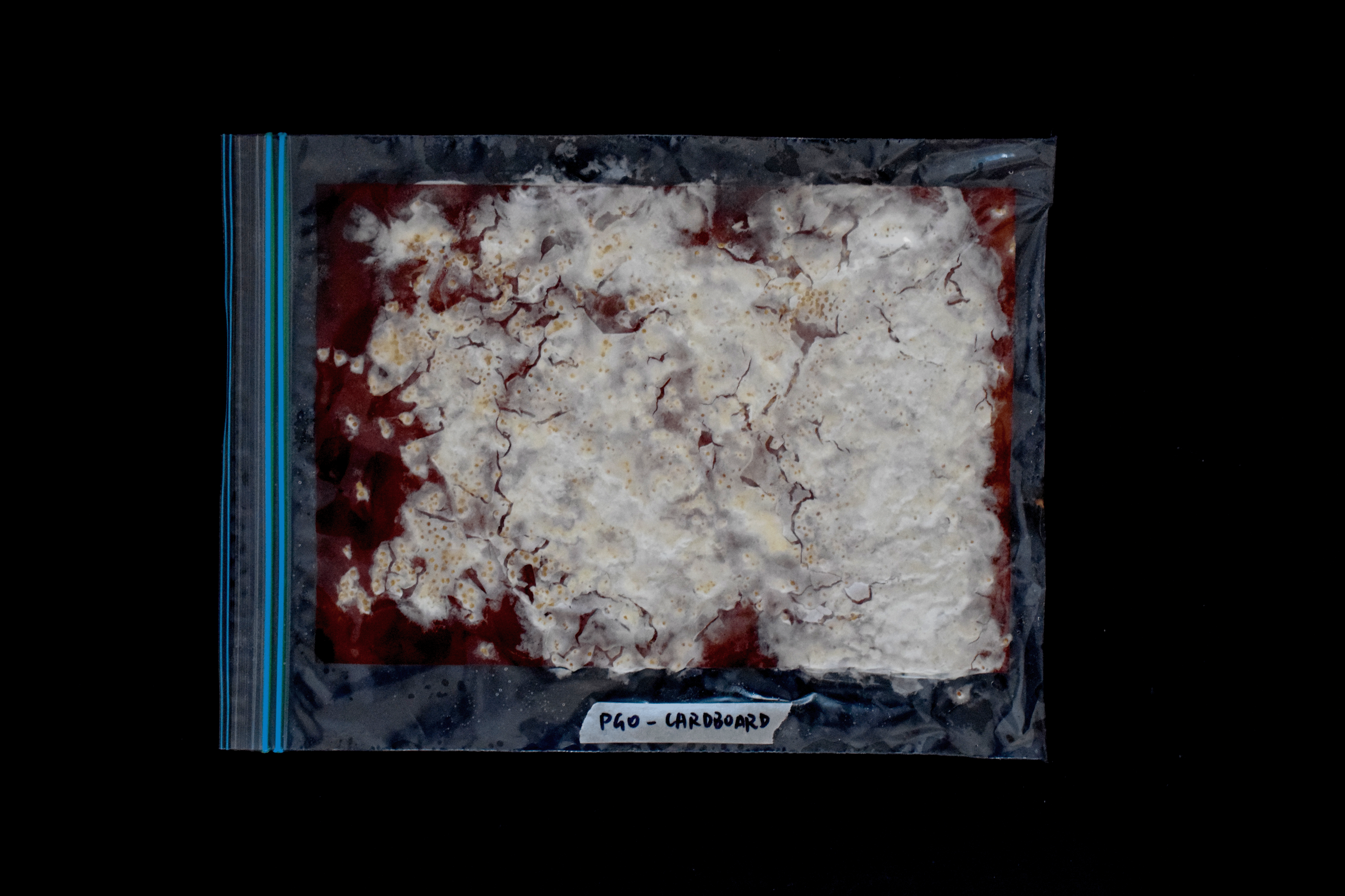
Similar processes, at different rates, were observed on the other paper stocks. The PGO mycelium on Watercolour paper started becoming thin sheets that adhered to the surface of the ziplock bag, leaving the grains it had grown from, stuck on the paper below it.
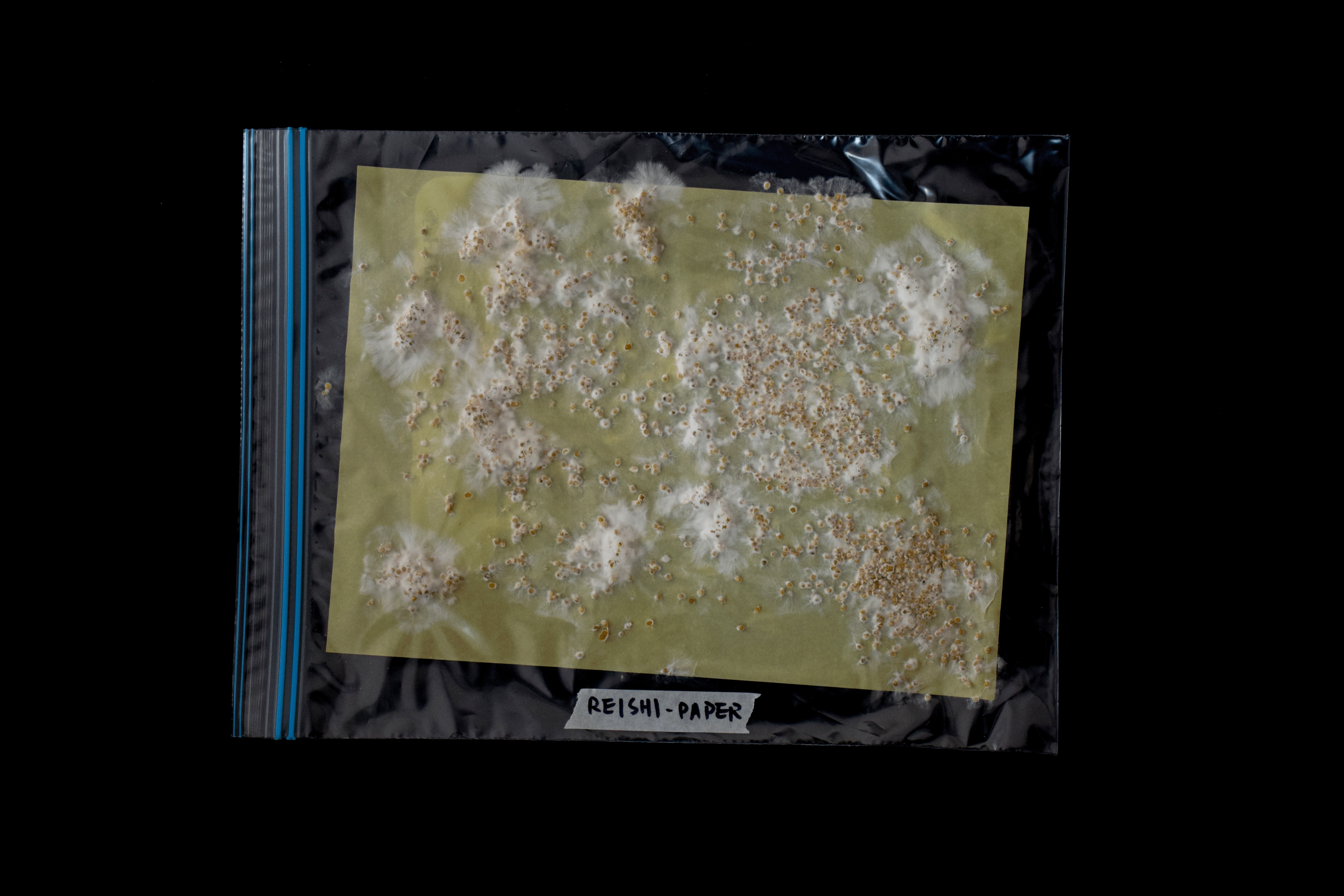
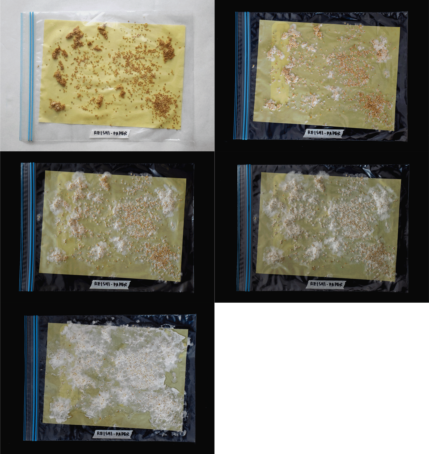
In contrast, the Reishi growth on both Paper and Watercolor paper exhibited a considerably slower pace, with less extensive growth in comparison to PGO. The mycelium would grow in web-like extensions from the heavily cultivated clumps of grain spawn, and would spread outwards gradually expanding outward until it made contact with other mycelial strands. These strands would merge, losing their web-like structure as they integrated into a unified mycelium network.
Reishi growth on copy paper
REFLECTION:
At first, I regarded this as an unsuccessful experiment due to the rapid and extensive mycelium growth, which disrupted my initial plan to map this growth into a grid layout in real-time. However, following discussions about the findings of this experiment, I was prompted to reconsider my definition of "failure." I had deemed it a failure because the growth did not conform to the traditional structures and hierarchies I deemed "normal" for a grid layout. Therefore, it felt like I was unable to map out the growth into a grid layout. Yet, this led me to question whether these random, mass growth patterns could serve as a source of inspiration for unconventional and innovative grid layouts.
DESIGN PROPOSAL:
The insights gained from this experiment have led to the proposition of an new unconventional grid layout that departs from traditional hierarchies and structures. Grid layouts typically serve to ensure design consistency and facilitate user content navigation, primarily relying on columns, gutters, and margins within a linear framework.
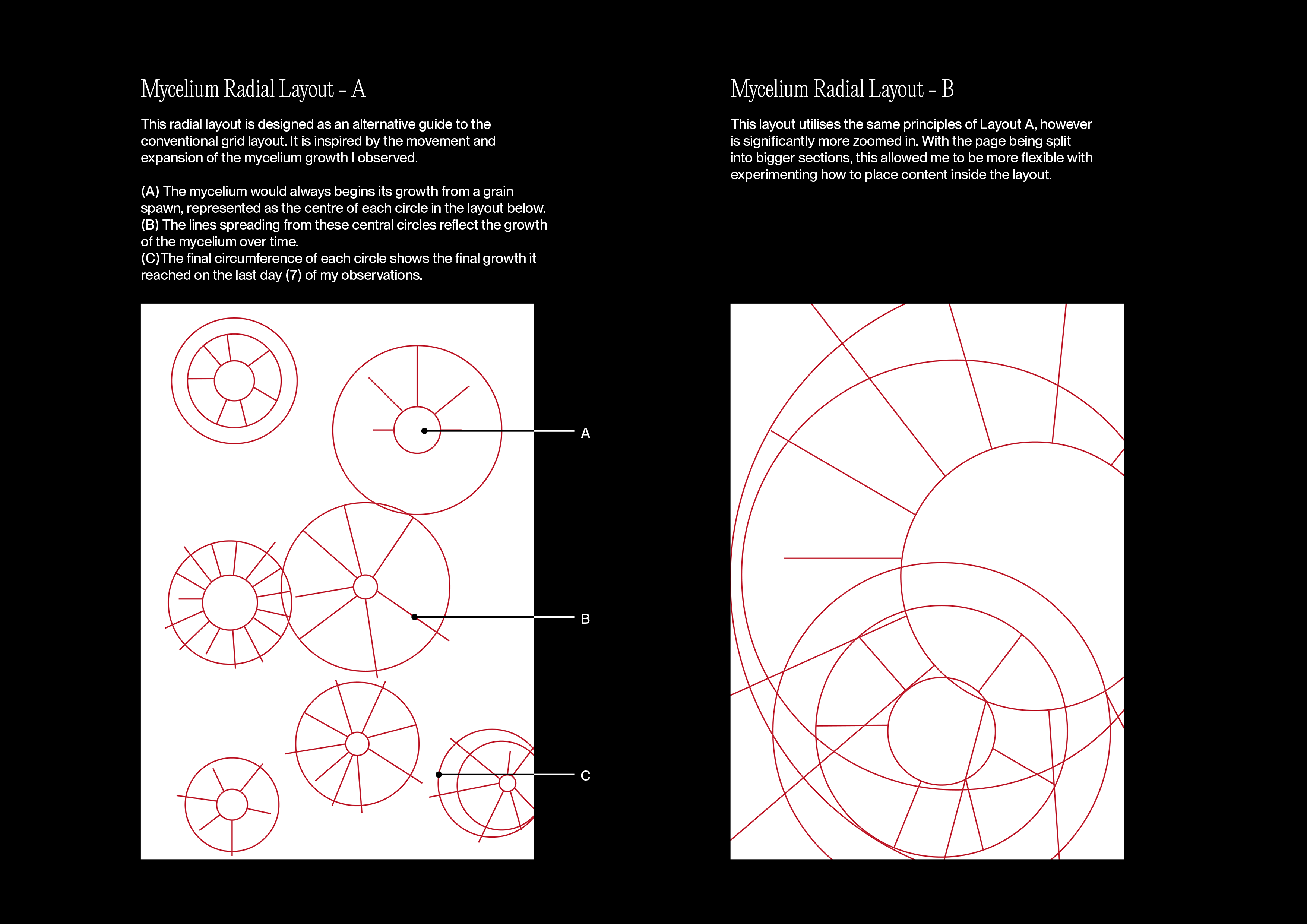
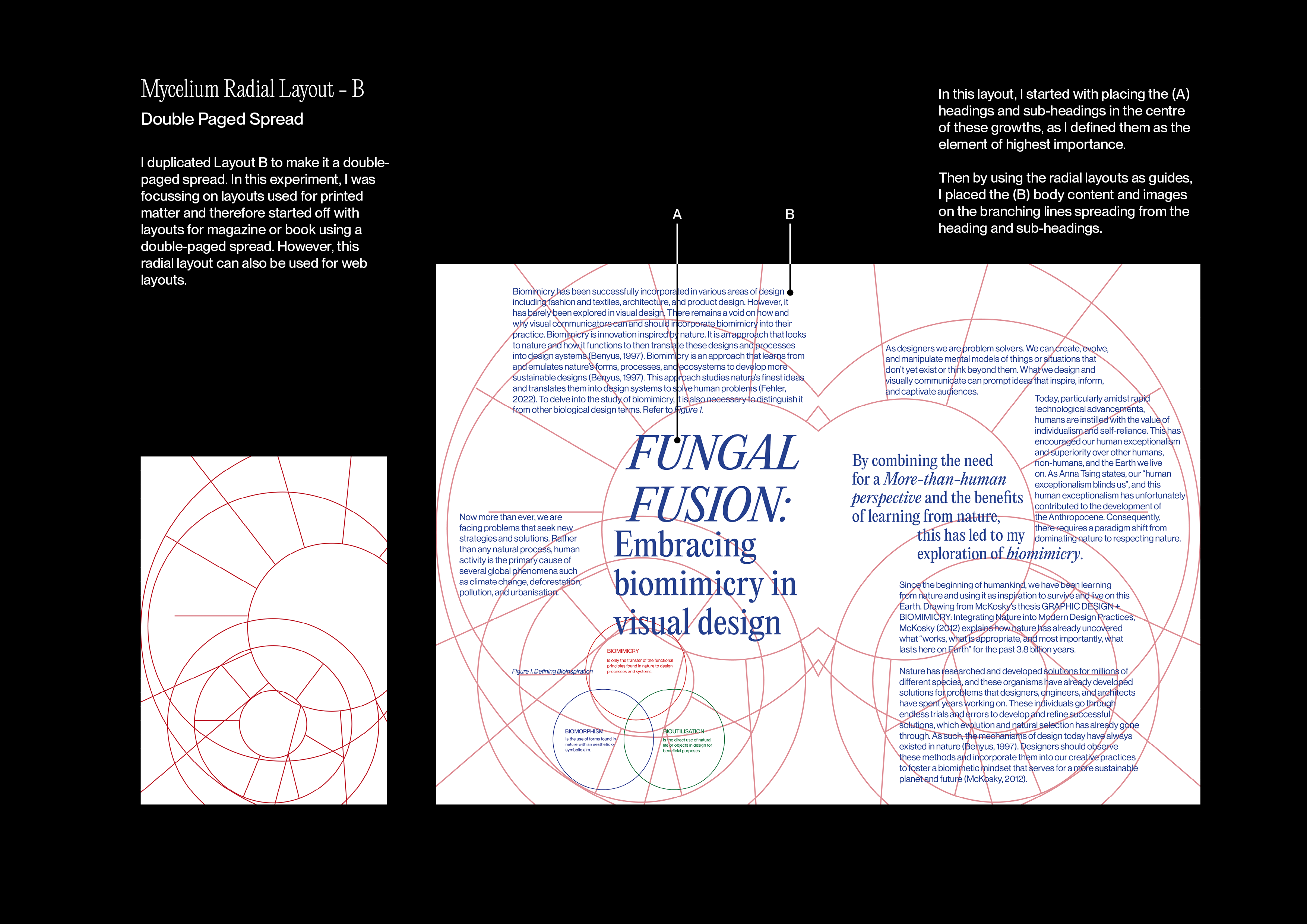
However, this innovative layout draws inspiration from the sparse and irregular growth of mycelium, with clusters of mycelium grain spawn branching out in rounded forms at varying rates and connecting to other branches. This new structure could feature circular shapes as its base elements, extending into branches where content can be placed. Subsequently, this would require a renaming of this structure to a "radial layout," as traditional grid layouts are built upon the foundation of rows and columns. The following process explains my experimental process of creating this radial layout.
Process of developing and using a radial layout
ANALYSIS:
Inspired by the way mycelium forms, the process of emulating nature can be a successful approach in visual design, specifically layout design as demonstrated in this experiment. Ultimately, this design proposition reveals that the process of biomimicry can be successfully incorporated in visual design.
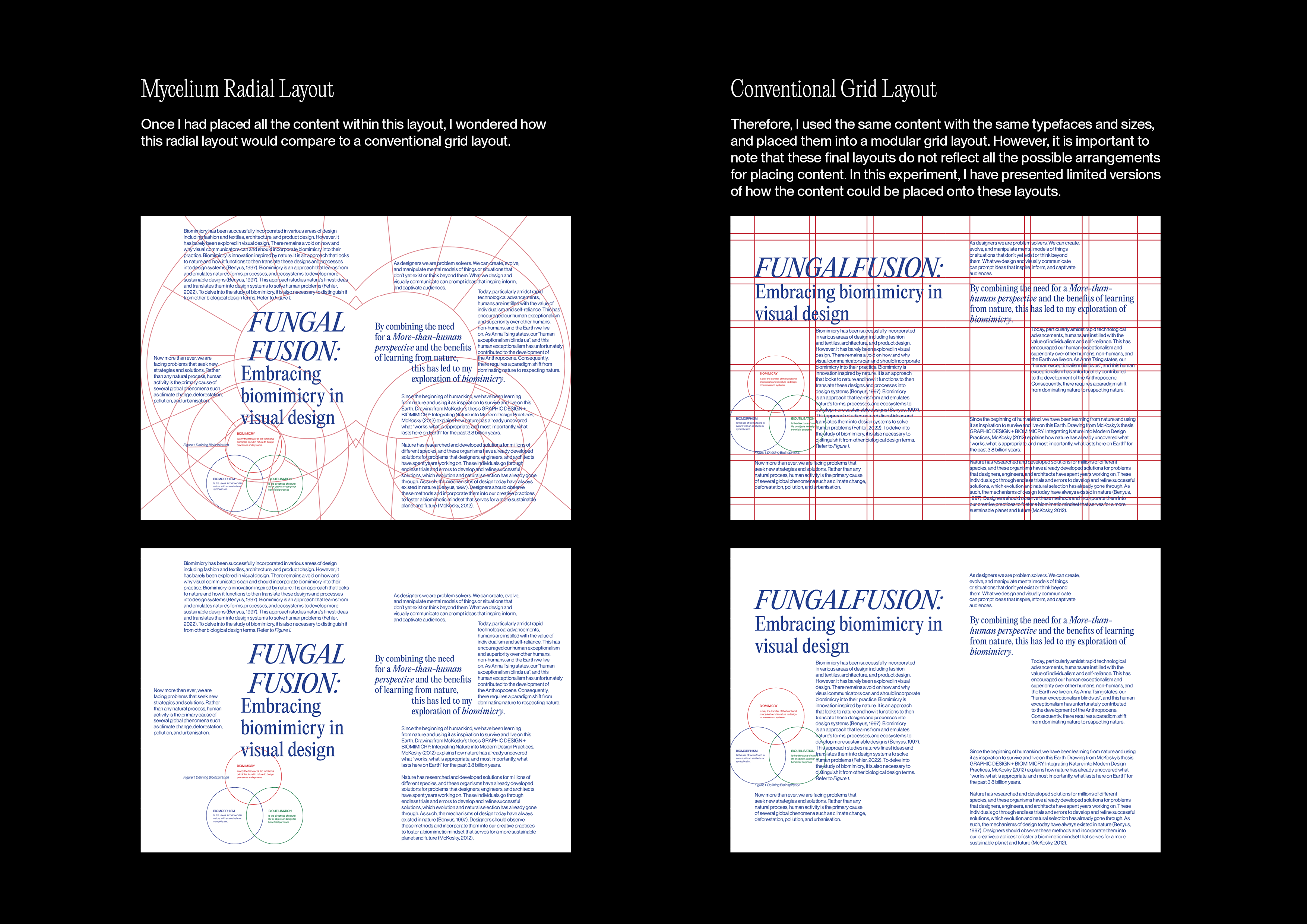
The mycelium radial layout was considerably more advantageous than the conventional grid layout. The mycelium grid offered greater ease in accommodating content, making it a more flexible and versatile option in contrast to the constraints of the conventional grid, where placement options were more structured and limited. Using the process of mycelium expanding outwards, this radial layout encouraged how we might rethink the hierarchy when reading and placing content. Instead of following a linear sequence for content placement and reading, this layout reimagines the structure. It encourages placing the most crucial information at the centre, while secondary content like body text or images can orbit around this central focal point. This approach fosters a fresh perspective on content arrangement and presentation.
However, the final results could benefit from additional experimentation in text design. To more accurately reflect the process of mycelium growth, exploring unconventional text formatting, rather than adhering to the typical left-aligned format, may provide more insights for this design proposition.
As I had been influenced by the existing foundations of a functional grid layout typically organised by columns and rows, I had inadvertently limited my exploration to alternative ideas. Human-centred design, while crucial for ensuring products and systems are user-friendly and effective, can sometimes be overly focused on meeting human needs and expectations. This focus can limit our ability to think outside the box and consider alternative possibilities that might not conform to the traditional norms of user-centred functionality. This design concept emphasises the necessity of adopting a more-than-human perspective in design thinking, to broaden our perspective and consider solutions that allow the exploration of unrestricted, innovative design concepts.